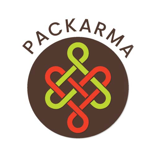
Business Problem / Opportunity:
PACKult’s USP is its ability to provide creative, sturdy, and sustainable packaging solutions to its clients. While there was no problem as such, there was an opportunity that we saw in this core competence, and branded it to lend an emphatic statement in its communication.
Insight:
A unique USP that borrows from the brand name, thereby becoming a strong reminder for the brand itself, and increasing brand recall.
Solution:
Mime coined the term ‘PACKARMA’ for brand PACKult, thus borrowing from the brand name and adding a sustainability angle to the nomenclature with ‘karma’. The Buddhist symbol of karmic knot was used as the visual anchor to create a logo that seamlessly blended with the brand through colors and typography.